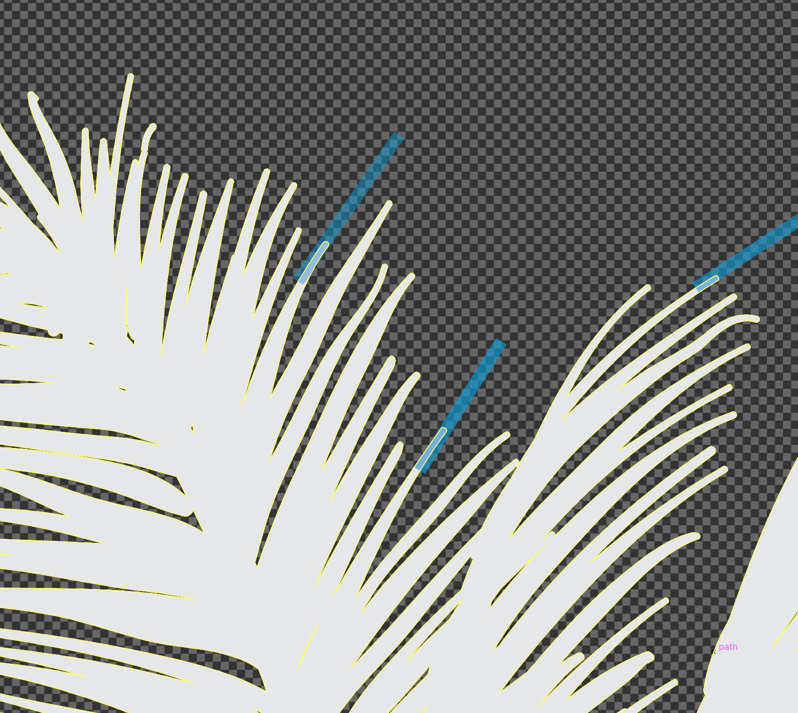
Fine Details are elements in your artwork where the ink is actually printed. Sometimes, this can lead to issues in the printing process.
There are some areas that may fall below our minimum print tolerance, which have a specific line/area thickness for 1, 2, & 3 color spot images. This is to ensure small areas and fine details print clearly.
Line Thickness 1, 2 or 3 Color Printing:
- 1, 2 & 3 Color - Line/area thickness 1 pt. or 0.01388 of an inch
- Performance - Line/area thickness 2 pt. or 0..02776 of an inch
These print areas are designated with a BLUE line. The thickness of the line represents the minimum print tolerance.
 Any areas that are thinner than 1 pt. will likely be too thin to print in order to hold their opacity and fine detail.
Identifying Thin Areas
The easiest way to determine small printing areas is to draw a line with a 1 pt stroke (Spot Color) and then move the line around your design comparing it with the smallest parts of the image.
Tip: Reduce the opacity of your “tolerance line” to 50% to make it easier to compare with parts of your artwork. You can also make your tolerance line a bright, contrasting color so that you remember to delete it before saving your file and uploading your artwork.

Correcting Thin Areas
The quickest and easiest way to thicken up an area is to simply add a stroke that is the same color as the thin color.
Keep in mind that thickening some printing areas may actually cause a non-printing gap around those areas to close in below the minimum non-printing area tolerance. If this is the case, a possible option is to scale the entire design to enlarge the printing areas and open up the non-printing areas.
Printing "As Is"
In some cases, you may want to elect to simply print the design "as is". Some cases for printing "as is" are designs are very small (like left chests or neck labels) there may be fine detail that cannot be thickened or designs that contain non-critical elements that will not impact the overall appearance of the print. We do not recommend printing critical elements (like the text) that are too thin "as is".
