
You may have gotten an alert about transparencies in your art. Let's go over what that means.
Full Color products print using translucent Cyan, Magenta, Yellow, and Black inks. If applied to any garment color other than white or very light color the full color image will need a solid white under base for the transfer to print opaque and bright on the garment. We automatically add the white under base to your transfer in the Full color Athletic and Fashion for Darks programs but there are some requirements for the art.
For the white under base to exist the artwork needs to have a solid edge and all areas in the art need to be at 100% opacity. Transparent areas in your art could cause a stall on the order. Effects considered transparent include, but are not limited to, glow effects, drop shadows, fades to non-printing areas, etc.
Our team might offer to make some of these corrections; flatten onto white (recommended most of the time), black or a PMS color free of charge. We could also use revised art, or print as is.
If your transfer will be applied to white or very light, we can print your artwork as is, however keep in mind that our adhesive needs to be solid and you may see a halo of the adhesive surrounding your artwork when applied.
Below are some examples of what the "Print as is" option would look like printed and pressed.
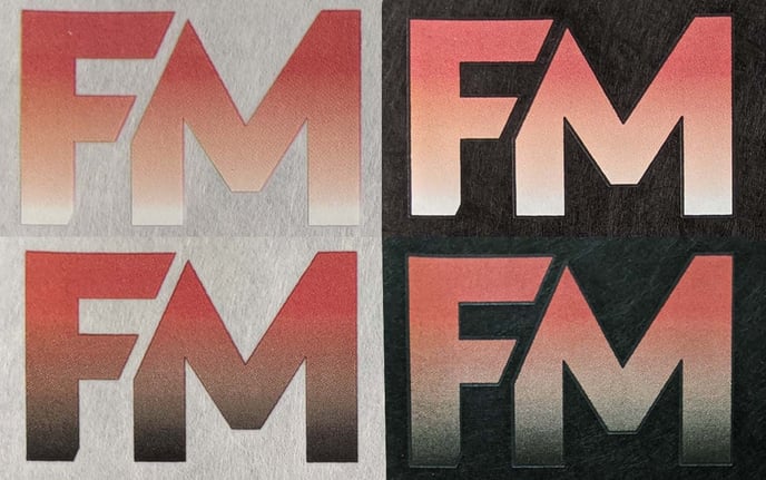
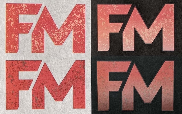
Print as is applied to white:
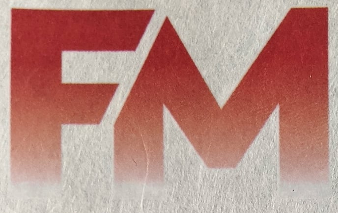
- This is a gradient with the opacity on a scale of 100% to 0% or non printing. As you can see in this sample, there is still a solid layer of adhesive - this is slightly visible, but does not compromise the overall look. A gradient like this works well on white or very light garments.
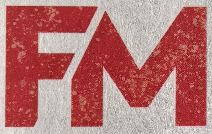
- This is a distress that is not completely 'knocked out' of the artwork. This creates a very light transparency in the areas where the distress has been applied. This looks great on white or very light garments, but left as is, you will see the lighter shade in the distress as the art is not a clean 'knock out' distress.
- This is a gradient 'glow' - this creates a soft halo effect around the artwork. A gradient like this works well on white of very light garments. This happened often with drop shadows as well. As you can see in this example there is still a solid layer of adhesive slightly visible, but it doesn't compromise the overall look.
Print as is applied to black:
- This is a gradient with the opacity on a scale of 100% to 0% or non printing. A gradient like this without any under base will be less visible as the garment color gets darker. As you can see in this example, there is still a solid layer of adhesive visible These two designs are hardly visible on black. It's a good reminder of why full color must have a white under base to be opaque on any color other than white or very light garments.
- This is a distress that is not completely 'knocked out' of the artwork. This creates a very light transparency in the areas where the distress has been applied. This is very difficult to see when printed as is on a black garment.
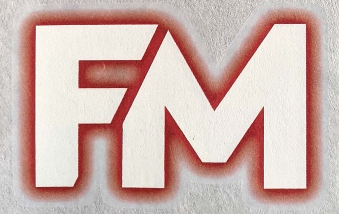
- This is a pink 'glow' effect around a solid white type ( kind of like a neon light effect) This creates a soft halo around the artwork. As you can see in this example the white center of the artwork is visible as this area can fit the solid white backer but the entire glow is barely visible on black without any under base.
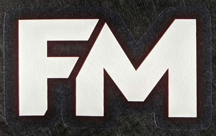
Transparencies flattened on white and black:
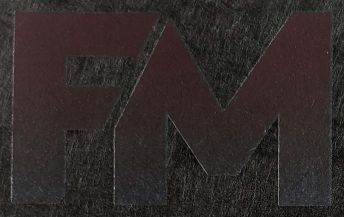
- This is a gradient with the opacity on a scale of 100% to 0% or non printing To solidify the edge of the artwork we add a white or a black layer underneath the entire design, all the way to the edge of the gradient. The background material will determine how noticeable the adjustment is.
- This is a distress that is not completely 'knocked out' of the artwork. This creates a very light transparency in the areas where the distress has been applied. When flattened onto white the distress areas become a lighter version of the art it was cut from and none of the garment color will show through. When on black it creates a patchy look on the pattern.
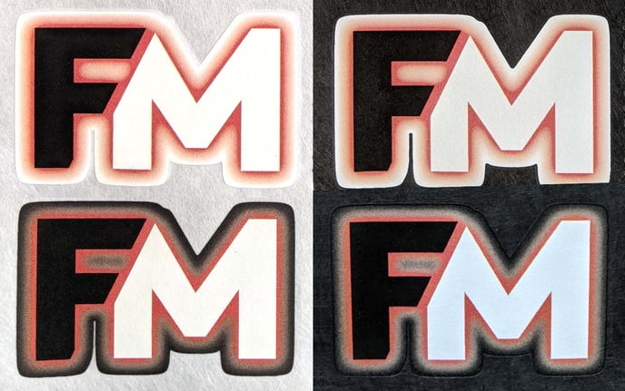
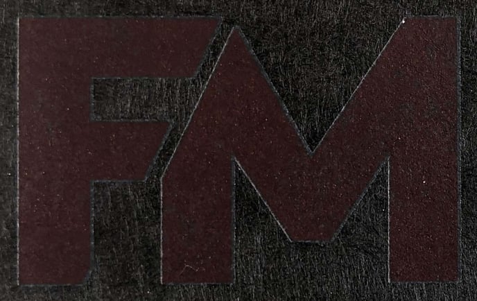
- This is a pink 'glow' effect around a solid black and white FM. When flattened on white or black you can see a solid outline around the art when pressed on a contrasting color.
Dealing with transparent areas is not a one size fits all answer. We heavily recommend reviewing these example images and your art to see which option might work for you when determining how to resolve issues with transparencies in your art.